3 Colourful Style Ideas for Kitchen Decoration
Edinburgh Flat Renovation Update .We moved in to our Edinburgh flat a year ago now and so far we have painted our bedroom walls in BOLD PORTHOLE BLUE, tiled a GOLD STAR in our Moroccan themed bathroom as well as wallpapered a Mairi Helena Harris Green FEATURE WALL in the living room.
.
We seem to have established a lack of fear when it involves picking colour for the walls, with the bolder, brighter and braver being the better.
.
Starting The Kitchen
.
So now as we eagerly plan the kitchen and get stuck in once again with colour picking, floor laying, musing of materials and wall painting, I thought I would share my ideas on kitchen decorating and in particular creating kitchen colour palettes.
.
PLANNING THE LAYOUT
.
Planning the kitchen has introduced me to the concept of 3D room drawings. Who knew that you could enter a kitchen fitting shop with your room dimension sizes and after a few clicks on the computer, a 3D model could be concocted from which to start visualising your new room layout. Brilliant for those like me who sometimes struggle with imagining the 3D set up in your head.
.
.
Anyhow, I’m leaving the complicated calculations, fiddly wall dimensions and cupboard sizes to Richard and storming straight ahead to the interior styling….
.
Essentially we’ve opted for cream units with oak work tops and now we can run riot with the complementing colours! Hip Hooray!
.
Now onto the exciting bit:
.
CHOOSING COLOURS AND STYLES
.
When it comes to choosing colours, materials and styles for the kitchens, I’ve discovered the following things:
.
Think about your laying space - don’t cramp on this and leave yourself with minimal worktop space
Splash backs are a must and therefore need careful consideration to a practical material
‘Where to put the bin’ seems to be the most difficult thing to decide (aside from choosing cupboard handles), why is this?!
.
...Anyhow, getting back to topic!! I have come up with 3 colour mood board ideas for kitchen styling. Each style is designed to complement the chosen core units and worktops but aim to provide very different looks.
.
Creating Mood boards for the Kitchen
.
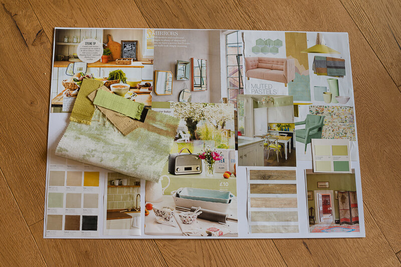
TRANQUILITY WITH PASTELS
.
Mixing muted pastel greens and putty beige with splashes of ochre yellow highlights.
.
.
A light, fresh, natural look, the colours of which complement the oak worktops and sing a Spring Summer feel!
.
.
.
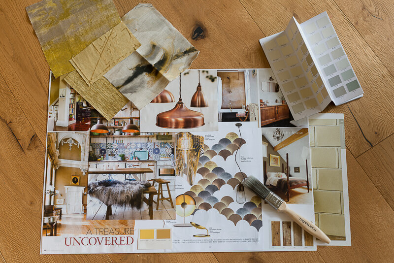
COOL CONTEMPORARY
.
Mixing gold, metallic palettes against the oak grain wood worktops. Introducing copper lighting accessories and mixing textures such as glass and sheepskin seating accessories could bring a very contemporary looking kitchen.
.
.
Classy, sophisticated copper, bronzes and hints of orange glows - I'm thinking trendy, modern, slick...
.
.
.
Tropical Hues
.
Introducing a striking green against a cool blue to create a zingy, tropical kitchen interior
.
.
Brilliant blue and white tiling to create a French style, both as splash backs and to appear behind open shelving.
.
.
.
So what do you think? I’d be really keen to hear what style out of the three you would pick for your own home? Please feel free to leave a comment below!
.
I think I've decided which of the three I'd go for.......although being the chef of the house, Richard has informed me he’s in charge of the kitchen……
.
However, I have my eye on part of the kitchen wall which I think would look GREAT in another Mairi Helena wallpaper design - who’s got my backing?! I’m seriously working on it.
.
X


